hunt + hawk
hunt + hawk
HUNT + HAWK
HUNT + HAWK
we take you higher
we take you higher
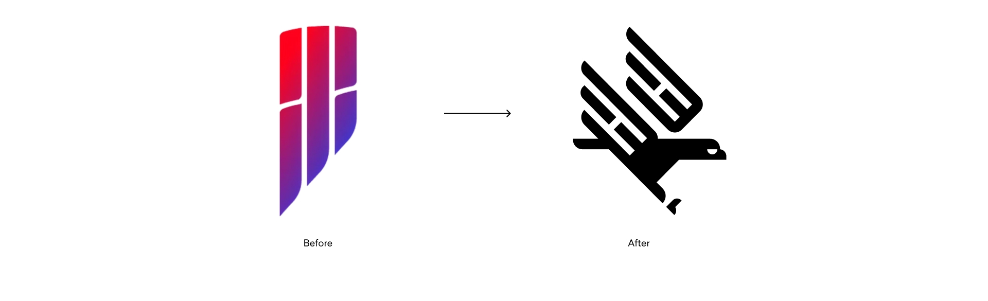
In 2021, I was hired as Hunt + Hawk's Design Director, the first person to hold the role. My inaugural project was a new visual brand identity for the company. Being new, and still something of an outsider, gave me the perspective to see what I believed was at the core of Hunt + Hawk's personality: fearlessness. That conclusion grew out of observation and listening, and from there, I designed the brand from the ground up.
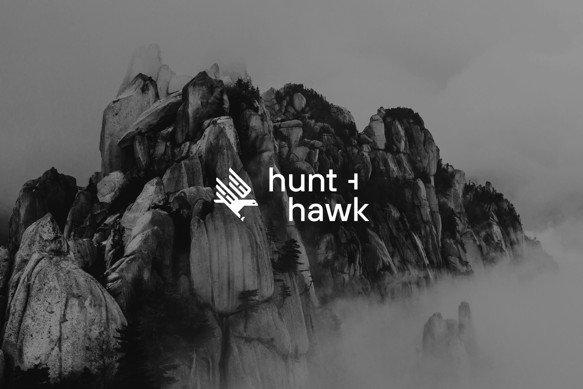
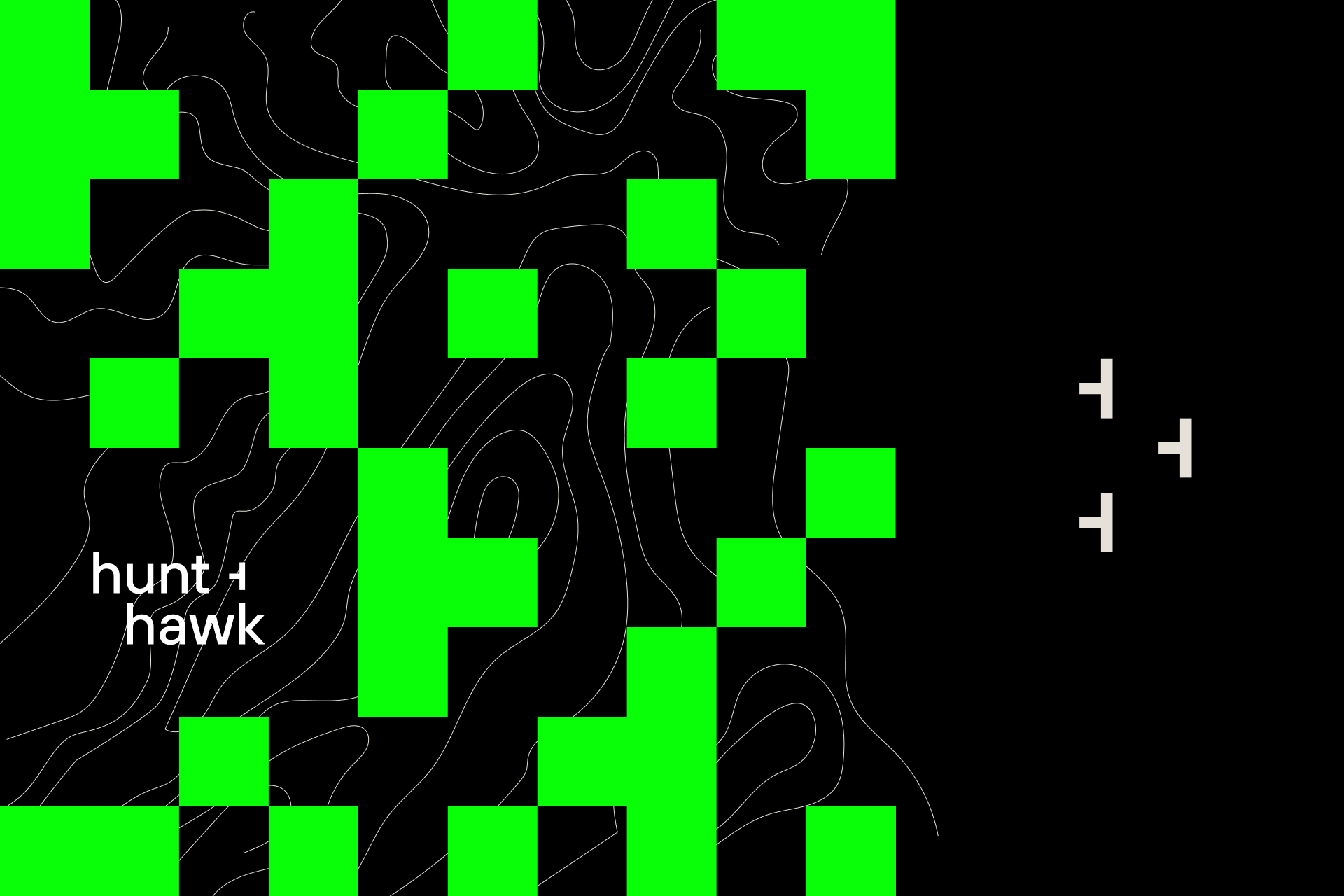
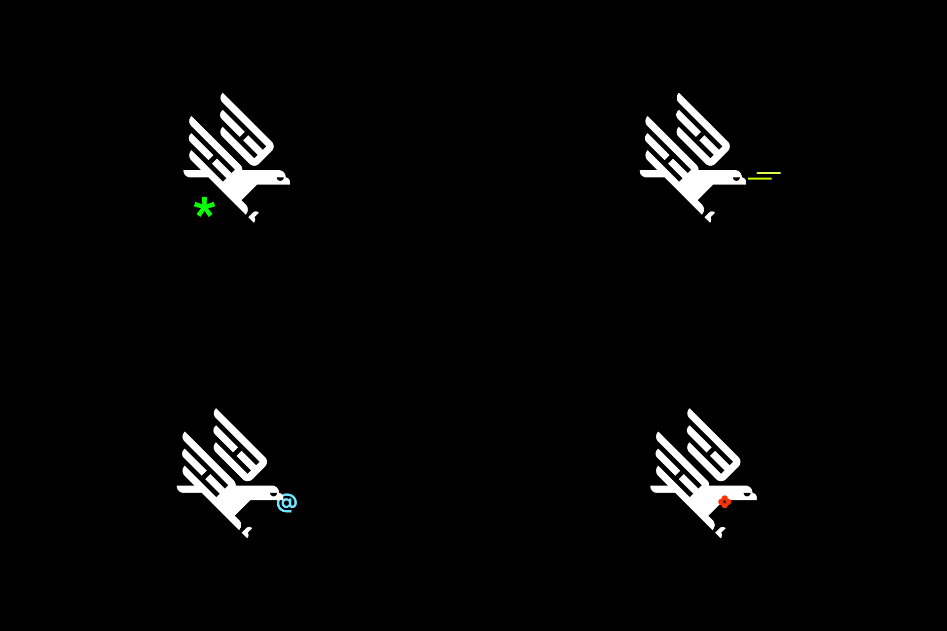
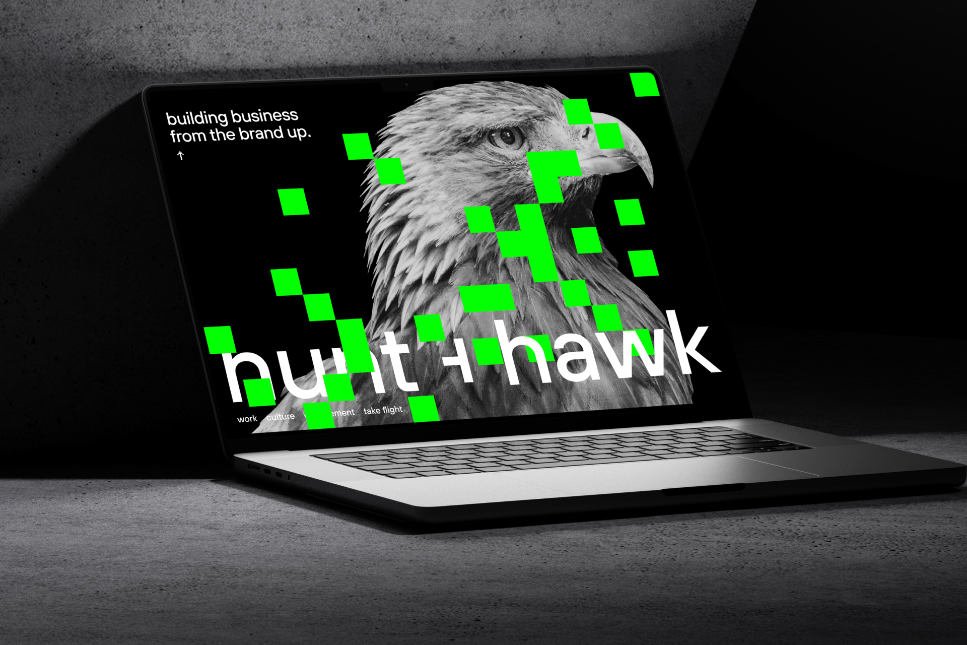
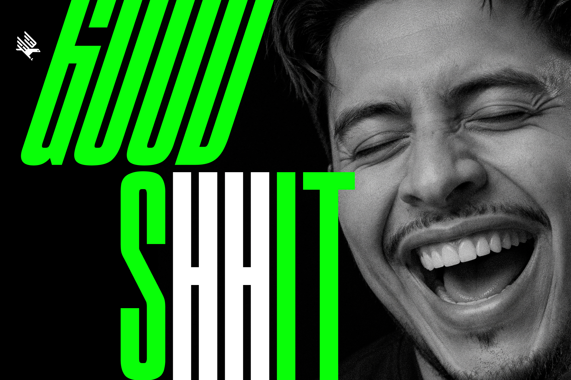
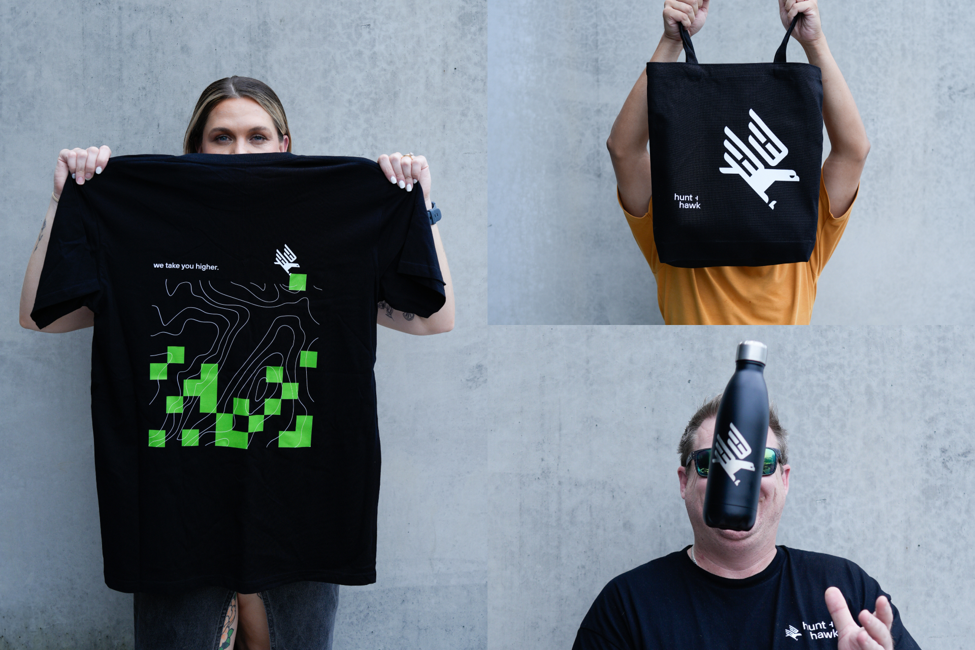
The idea I landed on was a hawk in pursuit. Not a static logo, but a character in motion, designed to lead the eye across a page the way Hunt + Hawk leads its clients through chaos to results. I built a full visual system around it: a bright neon green brand colour, which at that time was underused, the typeface TT Hoves, and two graphic languages (pixelated forms and organic, terrain-inspired lines) representing the agency's two core passions: technology and strategy. Every piece was designed to flex across applications while the mark stayed constant, giving a small but mighty agency a system that could scale as fast as it grew.
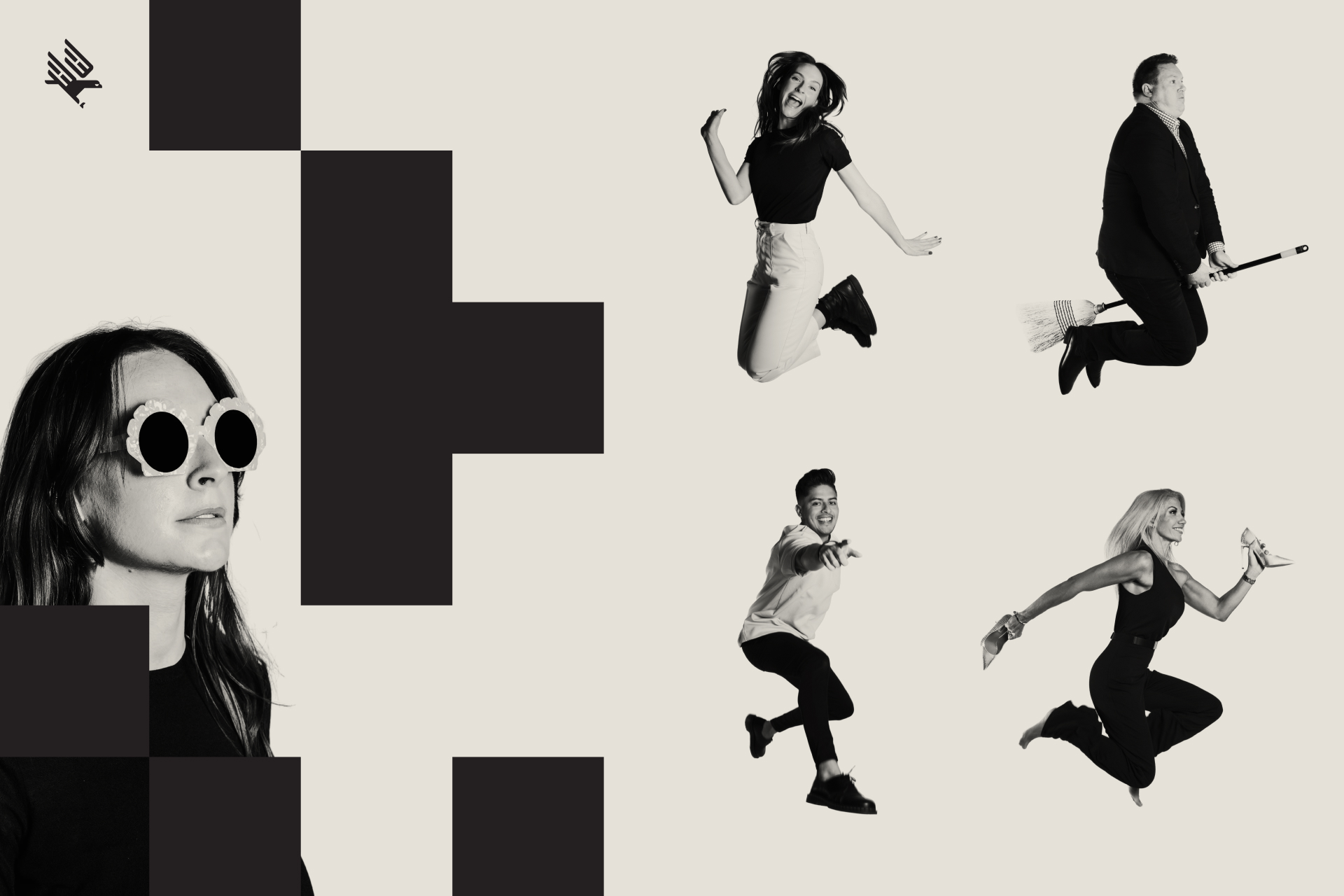
That foundation became the agency's website, which was design by Hunt + Hawk's UX/UI Lead and Senior Designer, marketing assets, and client-facing collateral.
project type
branding
agency
hunt + hawk
role
design director
designer
role
design director
designer
deliverables
logo
brand assets
credits
website – tim anderson, ux/ui lead