focus dental
focus dental
BRANDING
FOCUS DENTAL
dedicated dental specialists
dedicated dental specialists
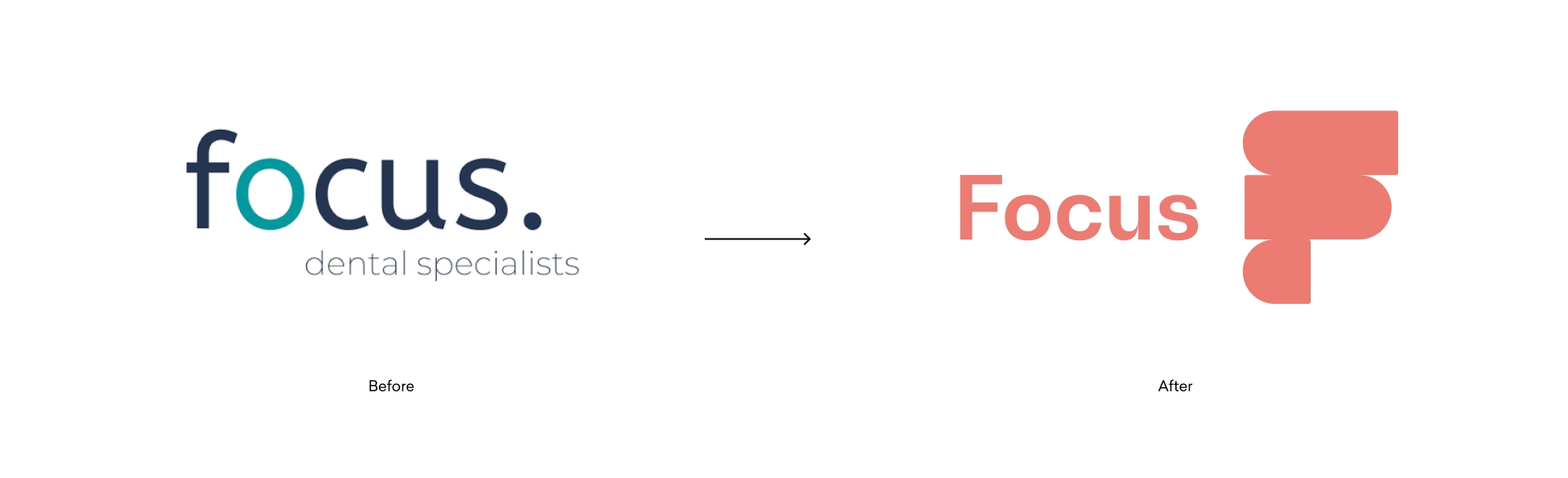
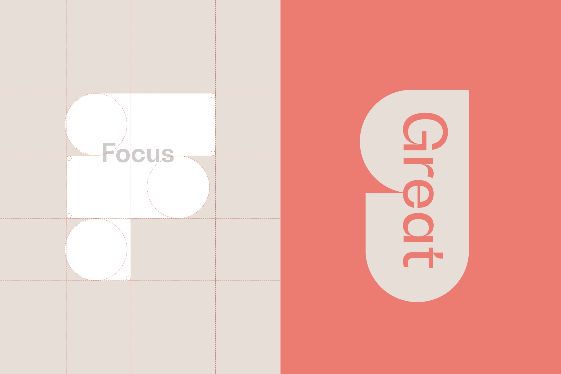
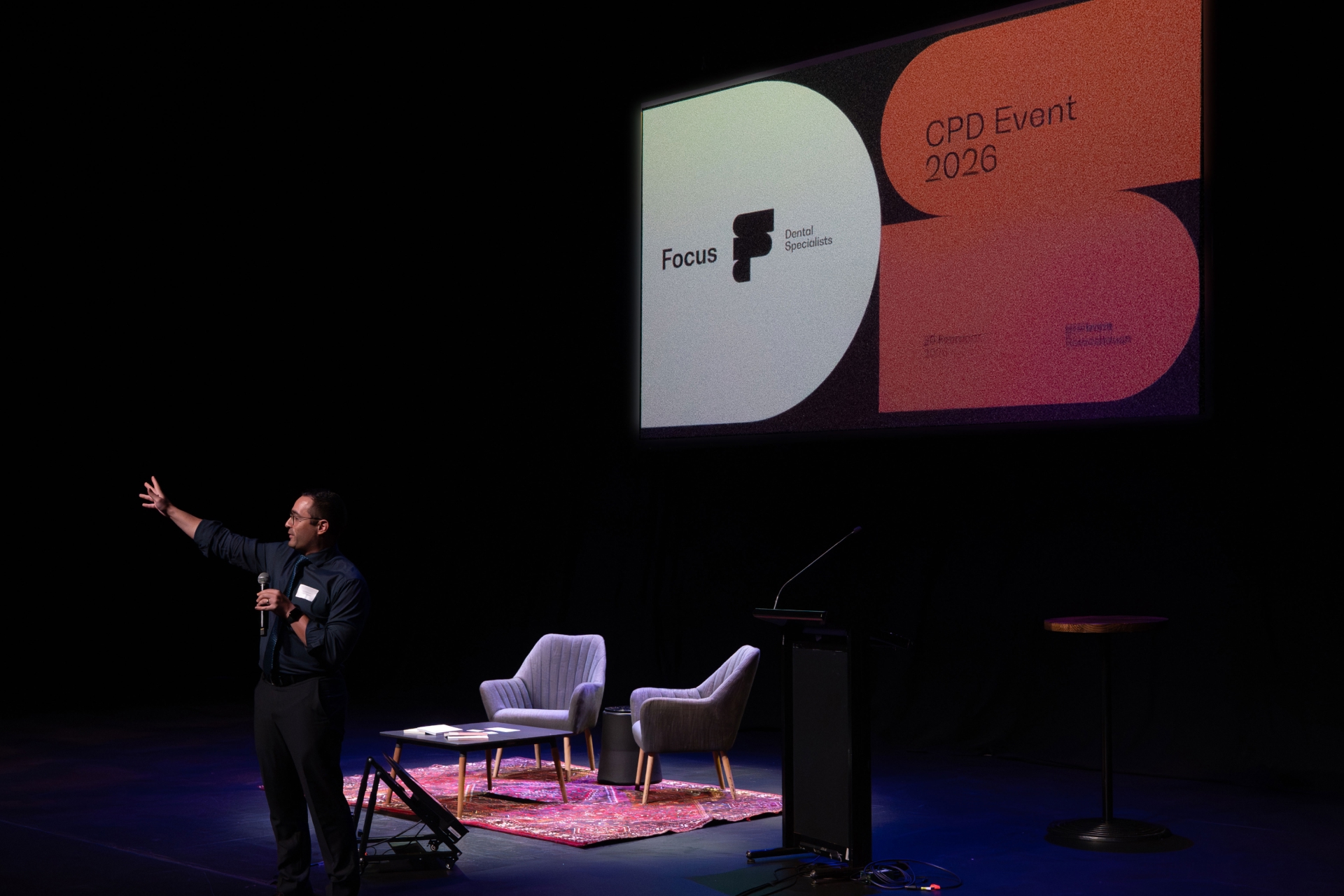
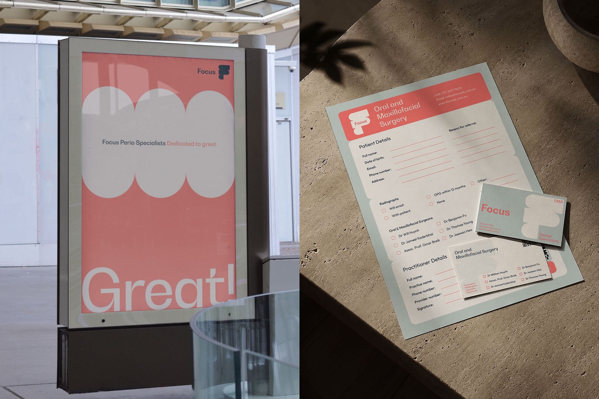
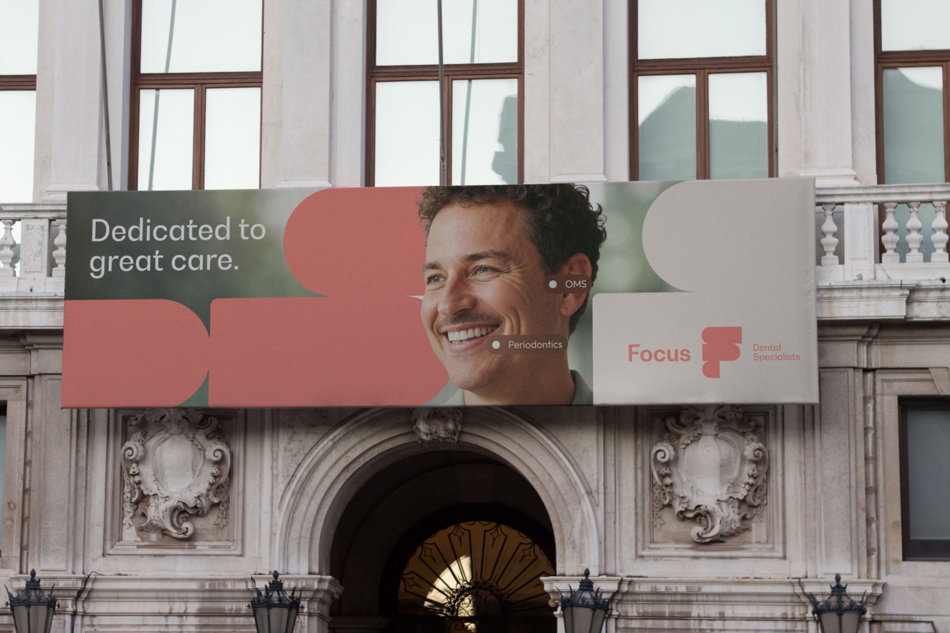
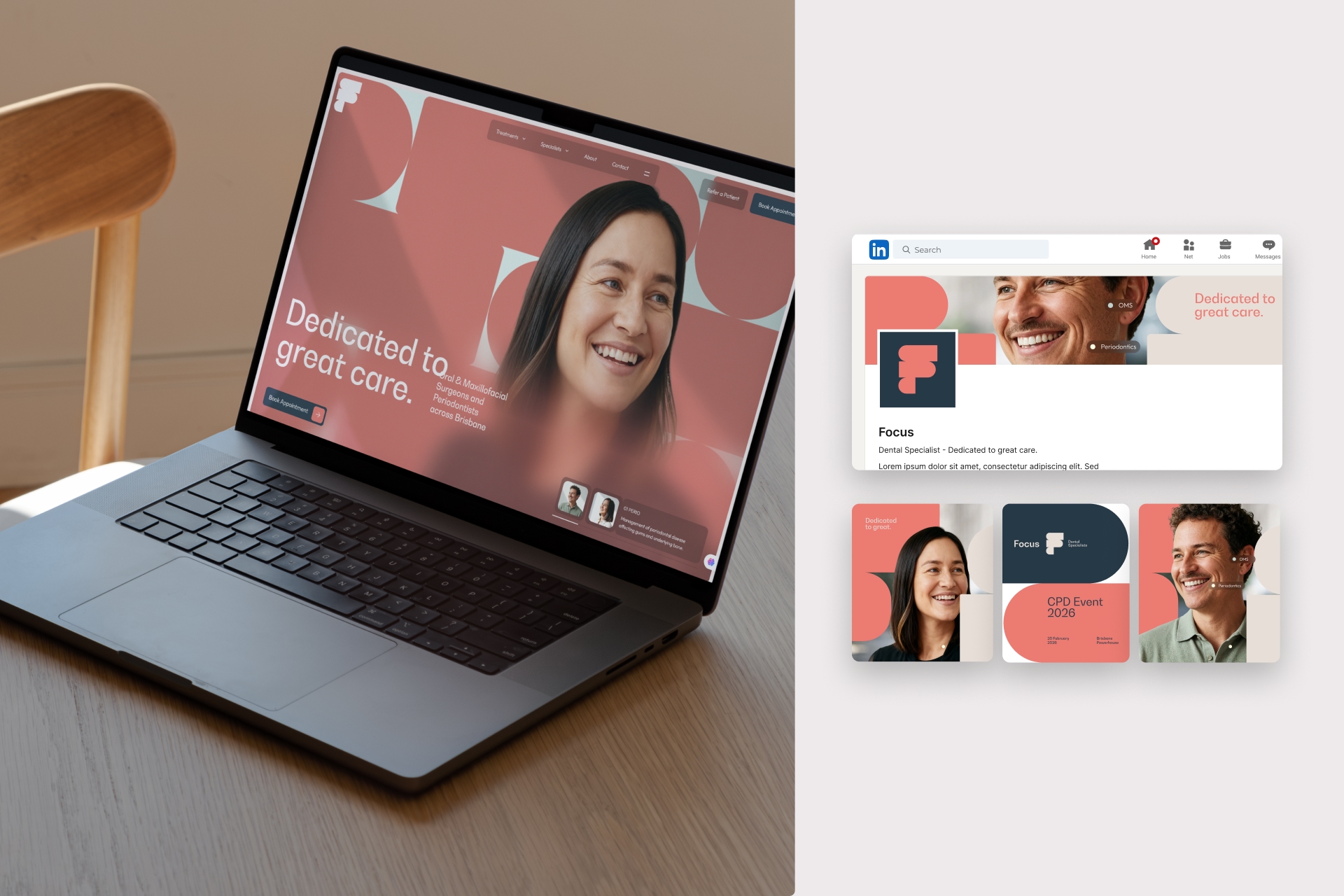
Focus Dental Specialists provide Oral and Maxillofacial Surgery and Perio treatments — in lay man's terms: mouth, jaw, and gum issues. These situations are very serious for patients, and so the brand need communicate its ability to be both warm and competent which is embodied in the strapline “Dedicated to Great Care.” The visual language aims to bring that strapline and the idea of “dedication” forward. With this mission, the team and I explored the simplified shapes found in teeth, gums and mouth. Those shapes in its simplest forms are rounded rectangles with a semi-circle end. From this motif, developed a variaty of fromations that utlimately lead to the logo symbol. The symbol is essnentially a stylised F that provide the visual cues that this brand is modern, clean, and confident. Together with the warm colour palette defined by the gum pink and a tooth off-white and supported by vibrant comforting blues creates an friendly and accesible feel. The dedication aspect is found in its function as graphic containre. It can house the brand name or typography, or an image which alludes to the idea that is protective and very focus on their patient's care. Echoing graphic language is the brand font, BW Gradual, which has round and high contrast of stroke widths that nicely connect to the shapes found in teeth and jaw, and of course the symbol. The overall also includes layer effects of blur and sharpness that echo the name of the company. All together, the visual language is modern, warm, uncomplicated, positive and professional.
project type
branding
agency
hunt + hawk
role
design director
co-designer
deliverables
logo
brand assets
marketing assets
credits
website: kazuma shimizu, sr. designer