p7
performance 7
PERFORMANCE 7
business-enhancing
breakthroughs
business-enhancing
breakthroughs
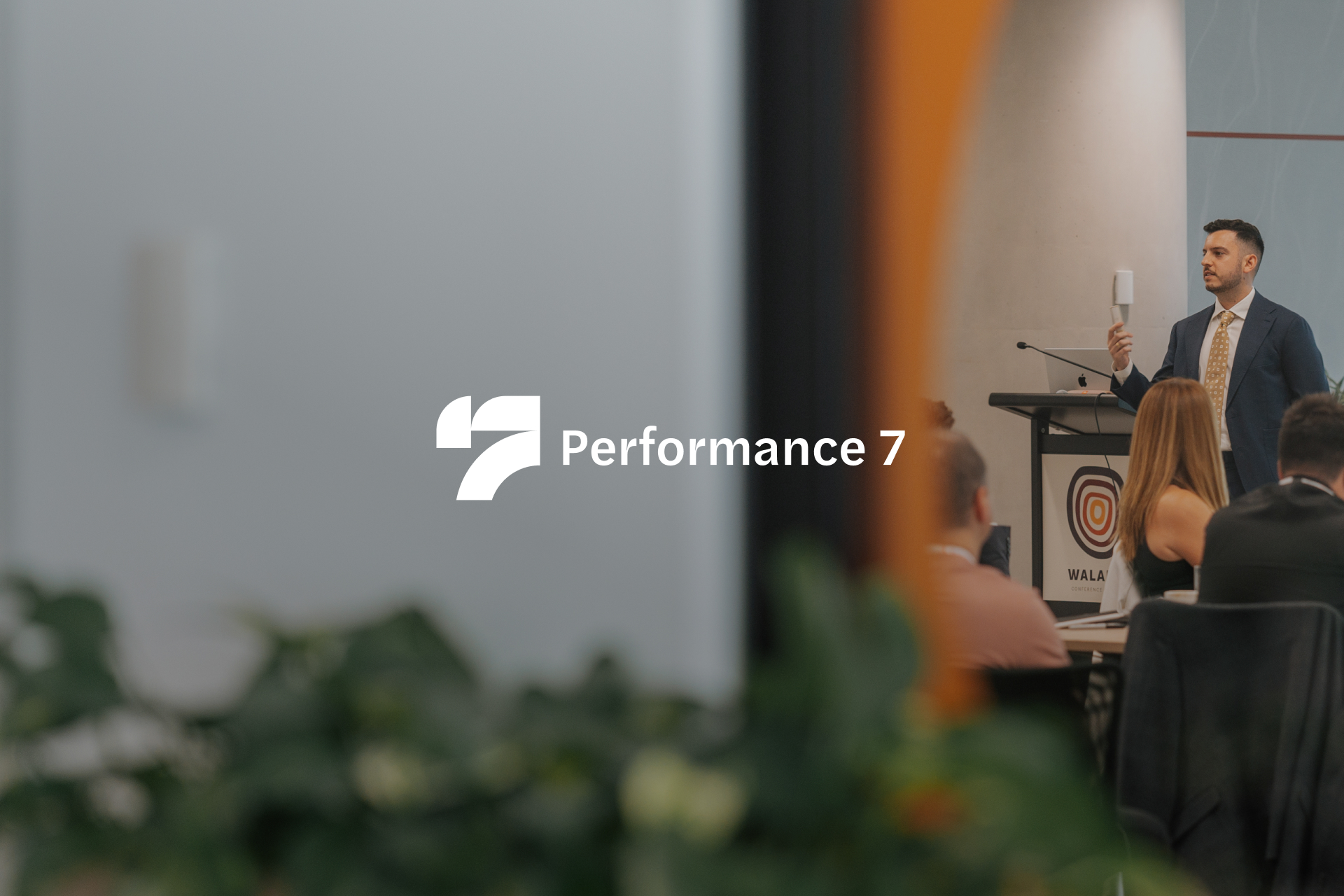
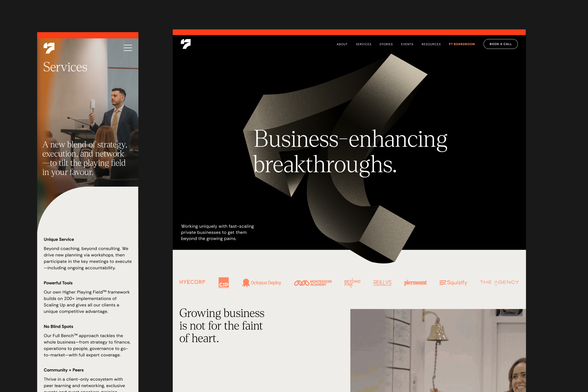
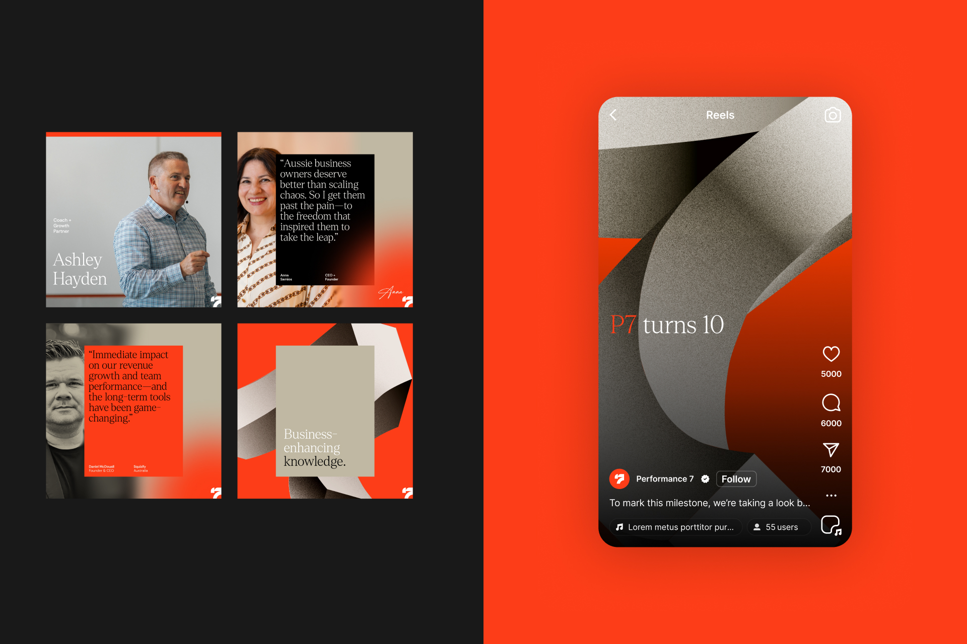
As Design Director, I developed the visual language that brought the strapline "Business-enhancing Breakthrough" to life.
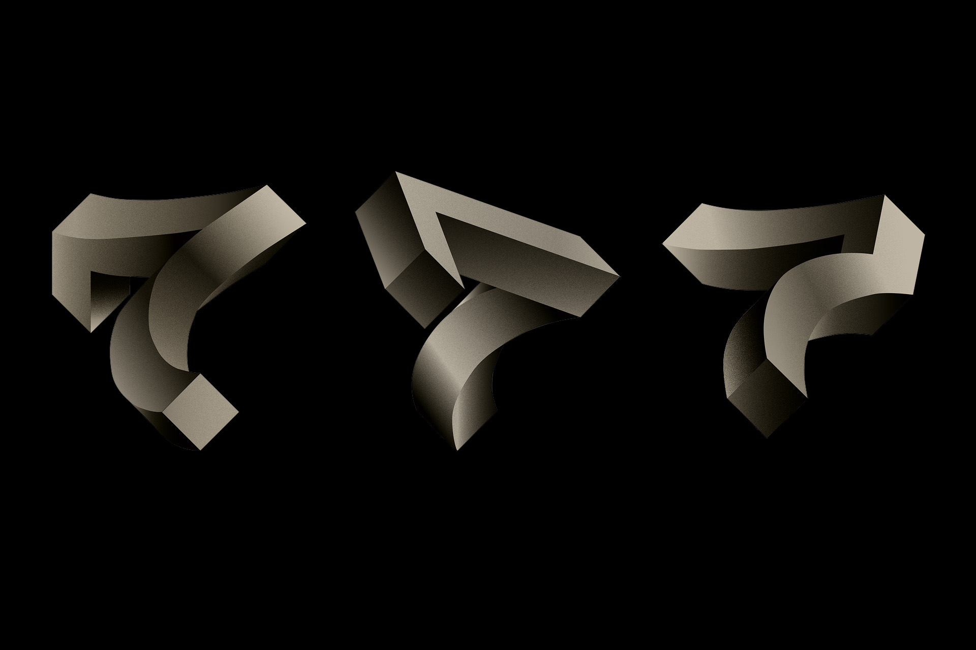
At the heart of the concept are dimensional, sculpted "7s" that provide presence and depth. This sculptural treatment nods subtly to the client's Greek heritage, while its solidity and form project the strength and confidence central to the brand's promise. Layered into the art direction are typographic cues drawn from sports, a personal passion of the client, and a recurring analogy they use to describe their coaching relationships and the way they serve their clients. This gives the identity an added layer of meaning that connects directly to the founder's story and coaching philosophy.
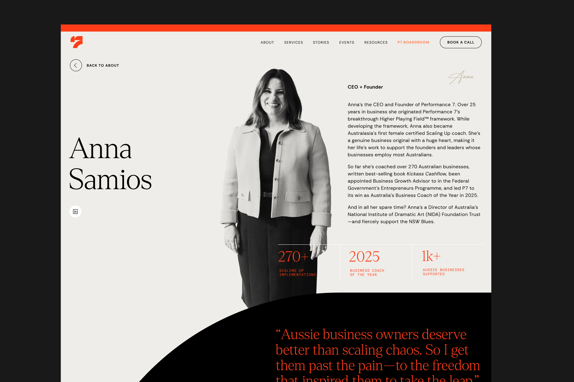
For the brand typography, we chose Denton, a serif that introduces warmth and personality to the brand while lending a refreshing sophistication to the P7 brand, balancing approachability with authority. The colour palette was built around a sense of quiet boldness: confident and considered, rather than loud, reflecting the calm but bold authority Performance 7 brings to its client relationships.
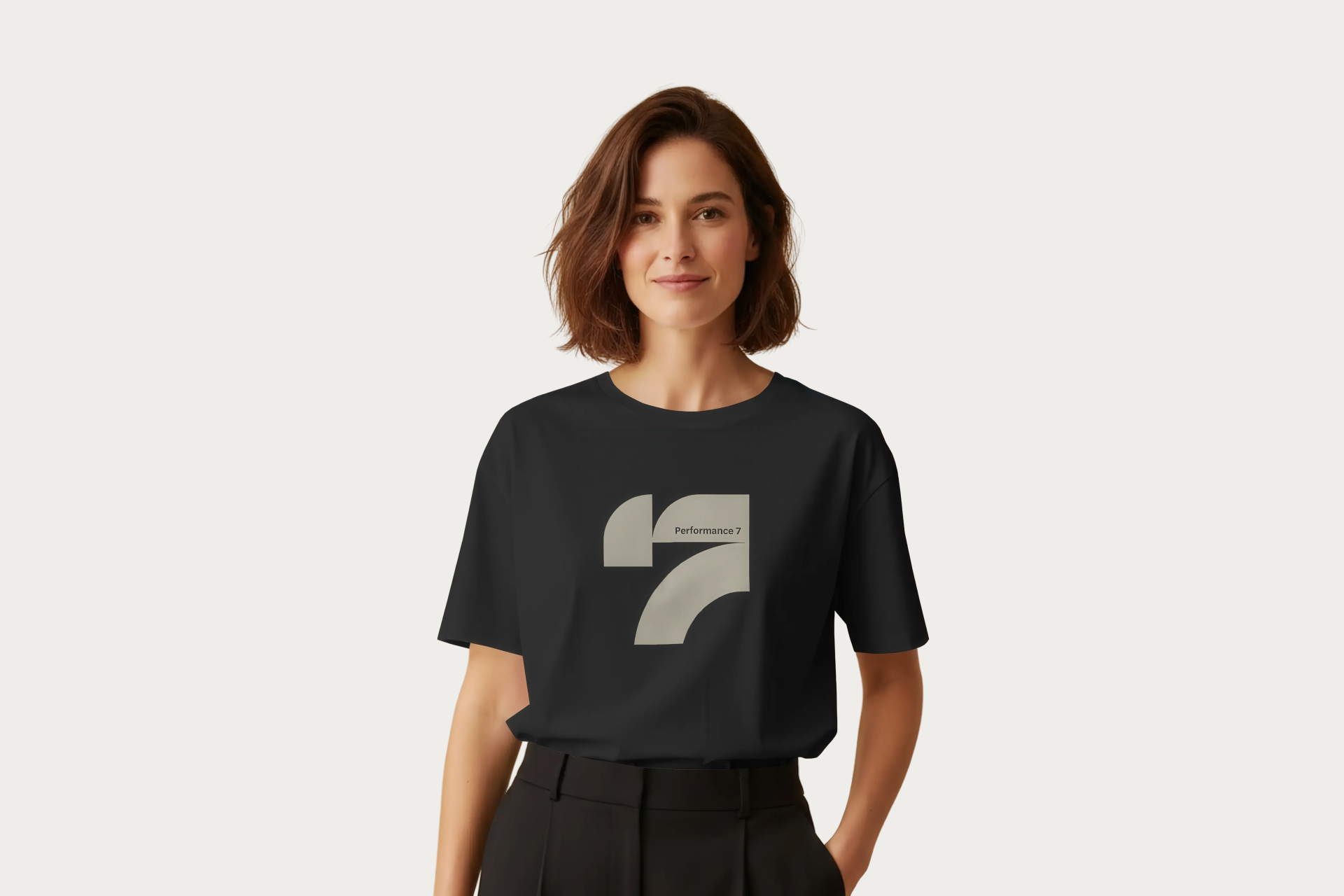
Together with the logo, these elements create a brand identity that is dimensional, personal and quietly powerful, much like Performance 7 itself.
project type
branding
project type
branding
agency
hunt + hawk
agency
hunt + hawk
role
design direction
design
role
design direction
design
deliverables
logo
brand assets
marketing collateral
website